Case Study
hochschulstart – A redesign that stays with applicants at every step
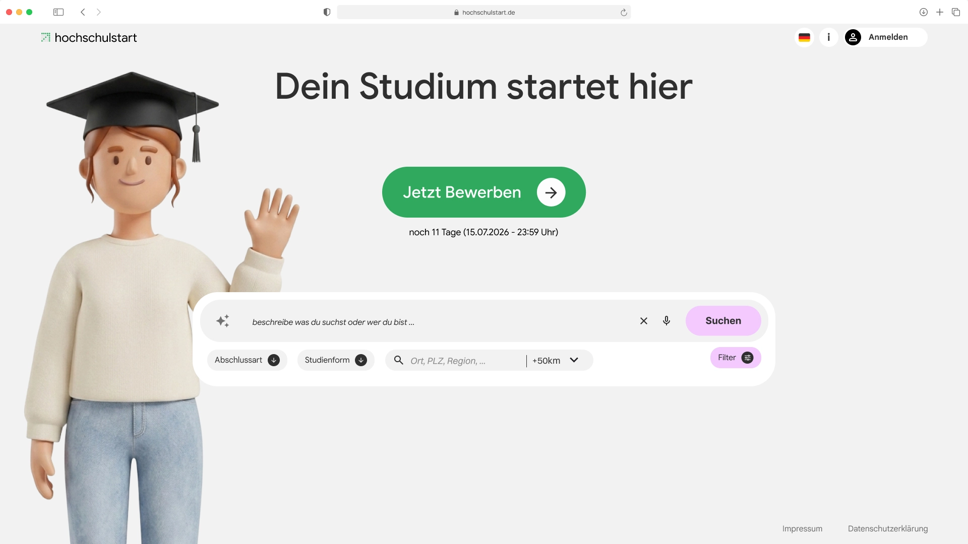
For many applicants, there is no way around hochschulstart on the road to university. Over one semester we analysed the platform, tested it with users and rebuilt it. The result offers an orientation area before the application, a visible process and one central place for all documents.
- My Role
- UI/UX design orientation concept design system
- Team
- Carla KonradKlara RichterLuzian HäbeTobias Wallisch
- Context
- Application Design 1 3rd semester HfG Schwäbisch Gmünd Supervised by Rebecca Götte
Problem Statement
Applicants have to work through a legally tangled admissions process without ever seeing where they stand or what comes next.
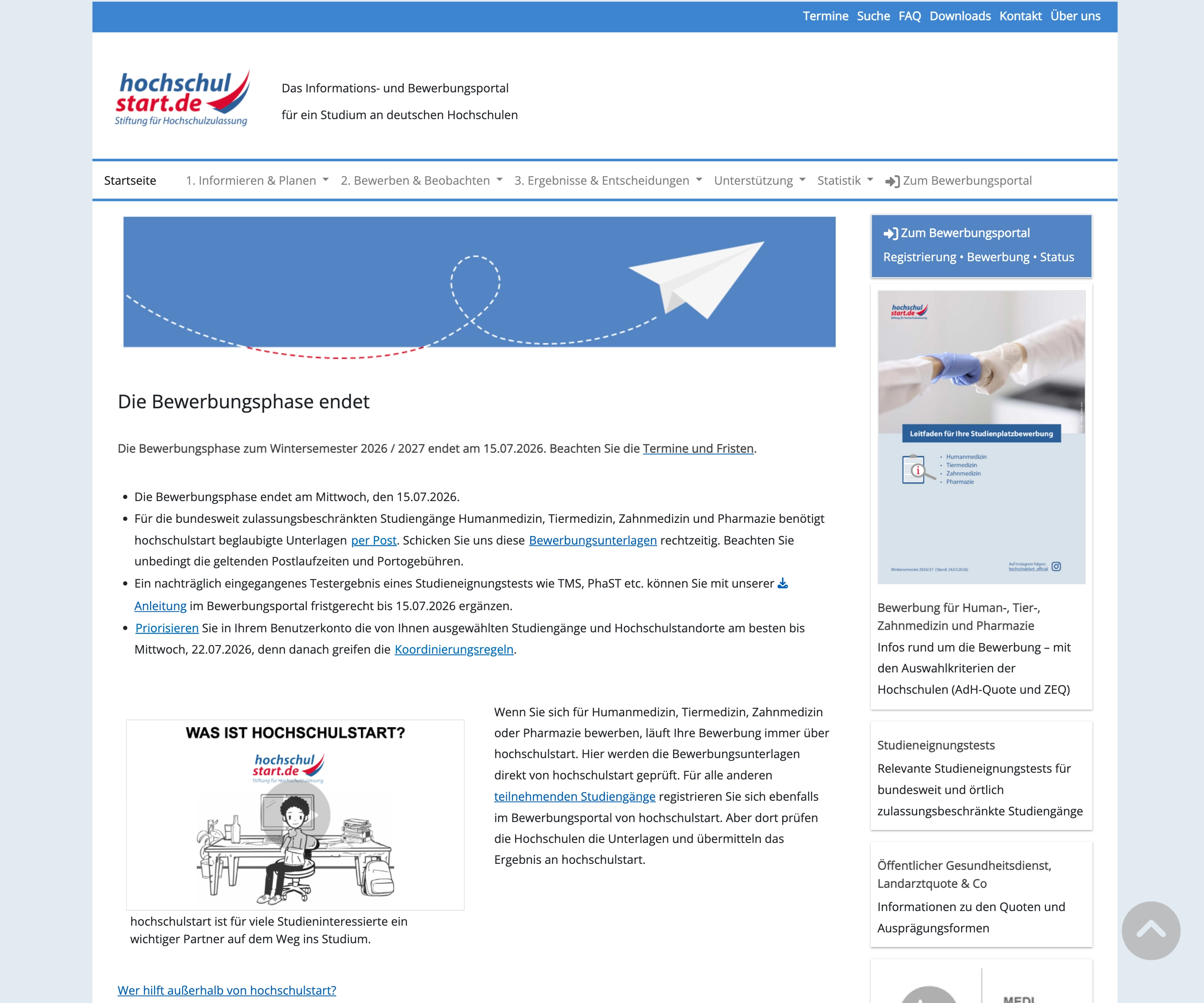
The application drags on for months, yet the portal never shows which steps are done and which deadlines depend on them. Decisions with a direct consequence for admission, above all the prioritisation of universities, are asked for without explaining their effect. Error messages don't name their cause, a reload can delete data already entered, and orientation before the application doesn't happen at all.
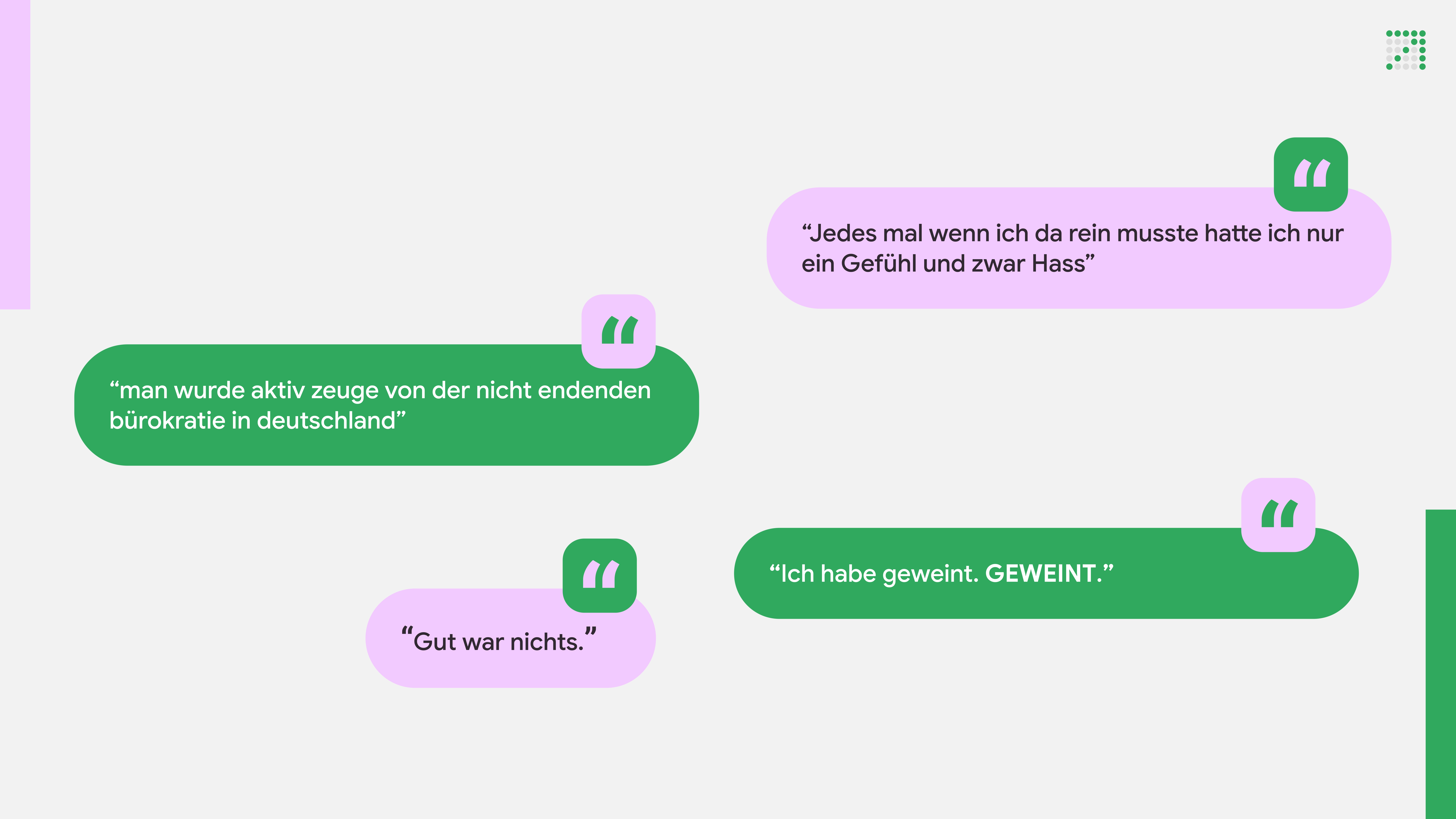
Hate
“Every time I had to go in there, I only felt one thing, and that was hate.”
Bureaucracy
“You actively witnessed the never-ending bureaucracy in Germany.”
Frustration
“Nothing was good.”
Sadness
“I cried. CRIED.”
Guiding question
“How can we guide applicants through the admissions process so they always know where they stand and what comes next?”
Concept
We split the platform into an orientation area and an application area and connect both through a shared favourites database, so no one has to commit at the start and no entry has to be made twice. A continuous process tracker, a central document hub, and a search that also understands everyday terms turn the process into an assistance system.
In detail
01Research
Two systems, one address
hochschulstart bundles two systems under one address. The DoSV portal is both an information site and an application platform; for the four nationally restricted subjects, AntOn is added, with its own login. Which path applies to your own case is something you have to work out yourself, and neither area shows any progress indicator.
Interviews
We talked to people who have been through the process or are in the middle of it. How emotional the answers were surprised us. The same structural points kept coming back. There were too many steps, unexplained consequences of prioritisation, a search that recognises neither medicine nor business administration, and a mobile view that only works if you zoom in.
Usability tests and competition
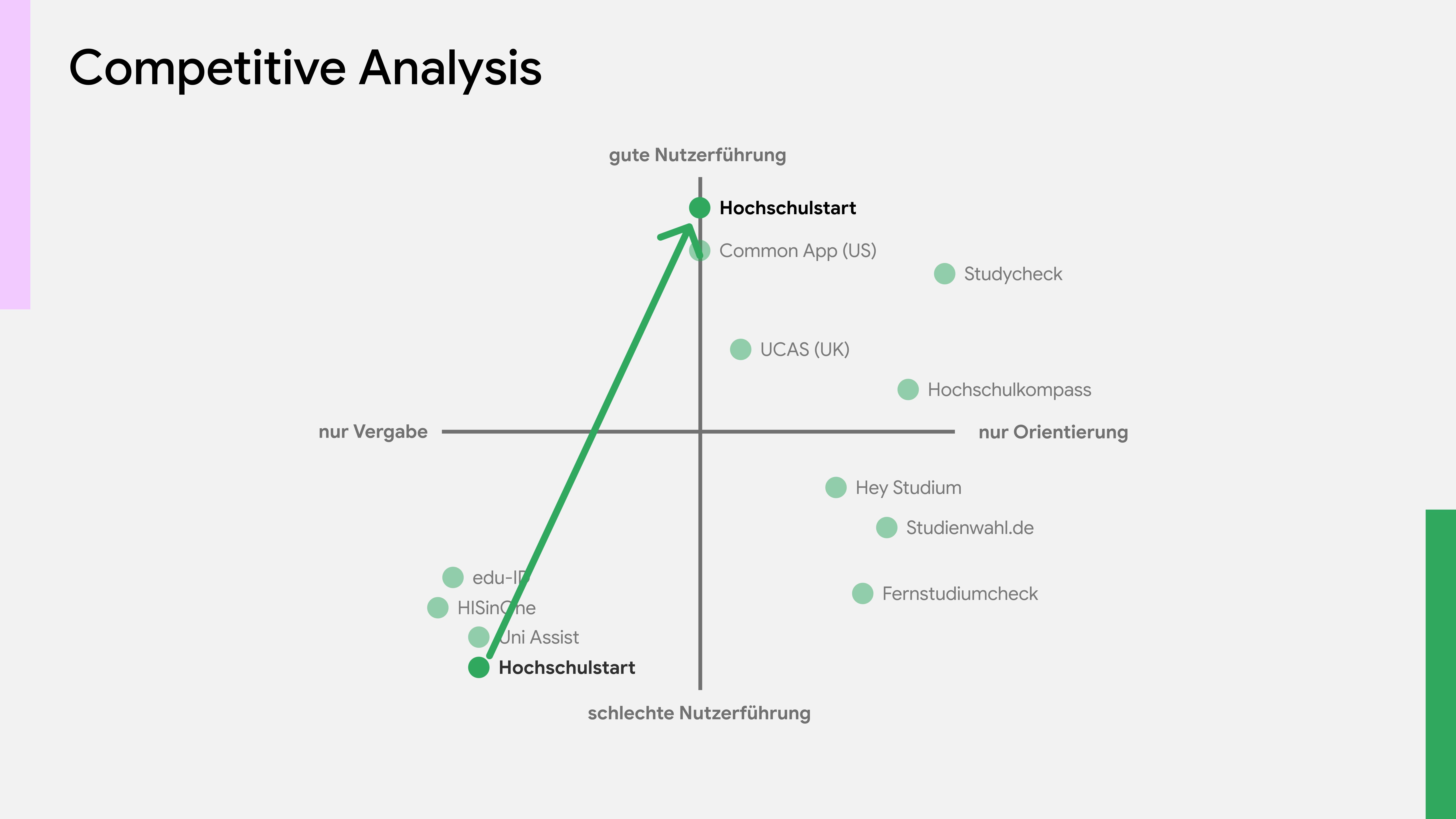
Four people with no prior experience were asked to complete a full application. The biggest source of errors came even earlier. Notes on password and verification are buried in running text, and after every error message the security check starts over. One test ended in abandonment, and for another participant a reload deleted everything they had entered. The competitive analysis showed a gap. No German portal combines good guidance with actual admission. That is exactly where we positioned ourselves.
02Decisions
Four paths, one need
Four personas emerged from the interviews, from the well-informed first-time applicant to the second-degree applicant with their own deadlines. However different their paths, their need is the same. Everyone wants clear guidance, transparent deadlines and one central place for all documents. As the primary persona we identified Louisa, a first-time applicant for human medicine. The value proposition canvas condensed this into three building blocks: document hub, semantic search and visible process.
Overview of the four personas developed from the interviews, including the primary persona Louisa, a first-time applicant for human medicine. Value proposition canvas with the users' jobs, pains and gains set against document hub, semantic search and process tracker. One platform, two areas
We split the platform into an orientation area for everyone who is still searching and an application area for everyone who has decided. A shared favourites database connects both. No one has to commit at the start, and a saved university moves into the application without being entered again. Three principles served as the yardstick for everything else: confident, approachable and supportive.
Diagram of two overlapping circles, orientation and application, connected through a shared favourites database. The three design principles confident, approachable and supportive, shown as a yardstick for UI decisions. 03Solutions
From as-is to to-be flow
We mapped the existing process down to individual interaction elements before designing our own. A sequence of form pages with no recognisable order became a named sequence of steps, including separate paths for hardship and special applications. In the design studio, every team member sketched under time pressure, then we combined the strongest elements. A combined search and filter bar and the process tracker above the form won out.
As-is and to-be flow diagram of the application process, contrasting the unstructured existing platform with the new, step-by-step sequence. Sketches and wireframes from the design studio sessions, combining individual concepts for sign-in, homepage, orientation and dashboard. Four wireframe stages of the application flow, from the low-fidelity layout to the finished step with applicant group selection and prioritisation. Visual language
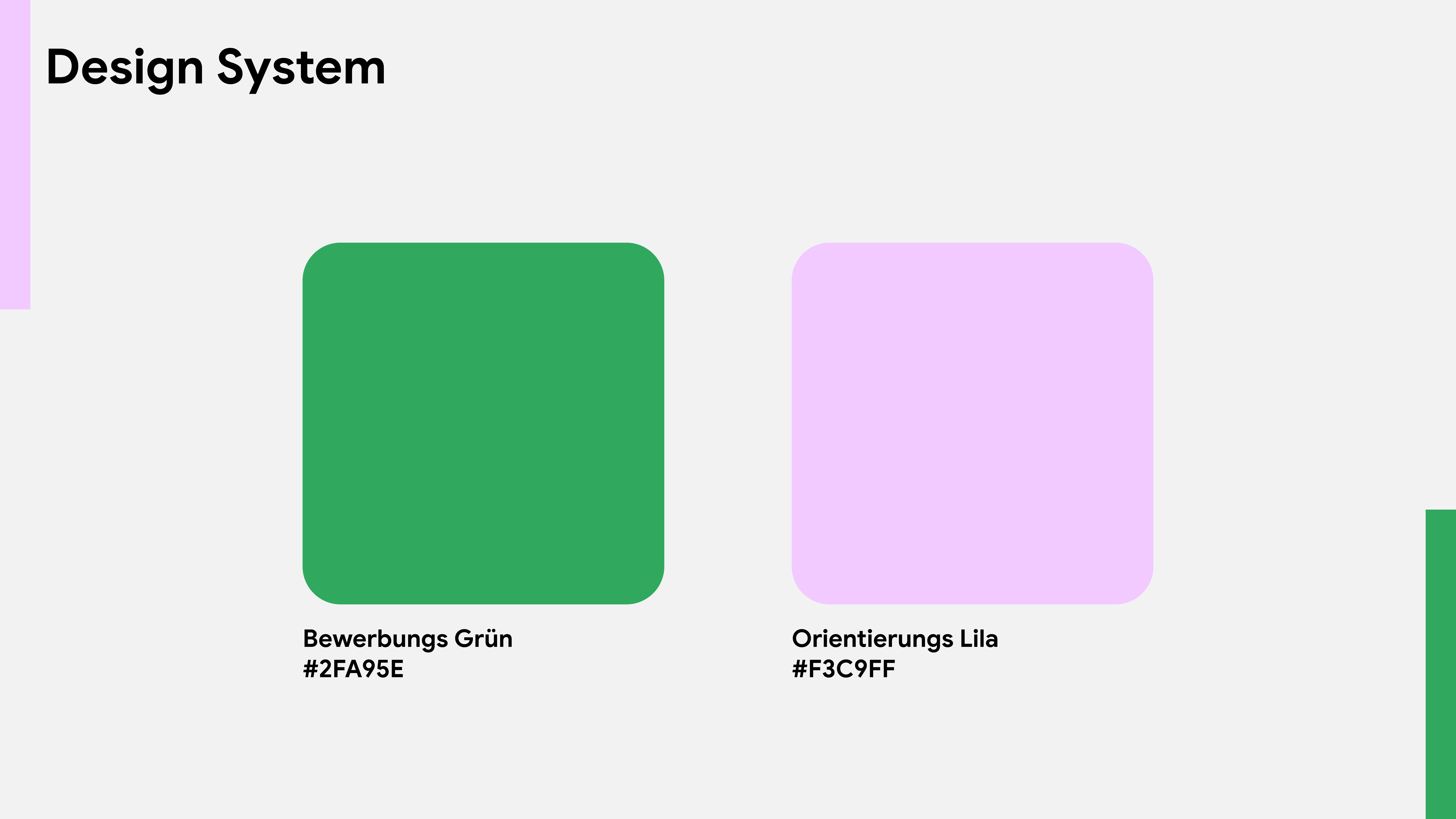
The two core areas have their own colours, green for the application, lilac for orientation, so you can tell where you are without reading. Rounded shapes, a geometric sans-serif and a logo made of rising dots take the database look away from the portal without taking away its authority.
The final prototype
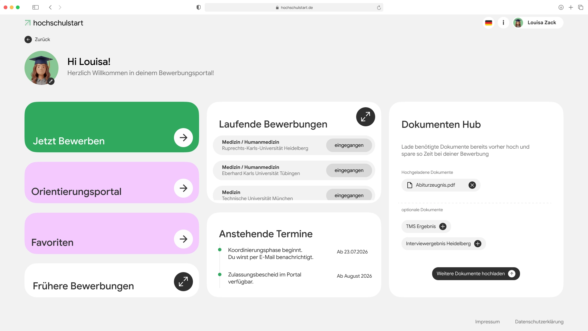
The prototype covers Louisa's path completely, from onboarding through degree programme and location choice with prioritisation to the confirmation screen with applicant ID, signed application and a timeline of the further process. The document hub lives in the dashboard and automatically suggests uploaded documents at the right place, so nothing has to be requested twice. You can click through the whole path yourself in the interactive prototype.
Interactive prototype
Loading the prototype connects your browser to Figma (Figma, Inc., USA). Your IP address is transmitted and cookies may be set. Nothing is loaded before you click. Privacy policy
04Result
Result
The outcome is an end-to-end prototype that maps Louisa's path from orientation to a confirmed application. The stepper shows at all times what is done and what follows, the document hub collects documents in one place, and the split makes searching for a degree programme part of the portal. What interviewees described as an opaque hurdle is, in the redesign, a path you can see.
Learnings
The biggest challenge lay in the groundwork. Fully understanding hochschulstart took considerably more time than planned. More revealing than any interview was watching uninvolved test participants. Only there did it become visible how many small points of friction add up to the frustration we had previously known only as a story.
Outlook
Still open are the special cases in their depth, the decentralised procedure, second-degree applications and foreign higher education entrance qualifications. The next step would be a usability test of our own prototype with the same tasks as on the existing platform.